Visualizing Temperature Changes Over Time

In the first part of this two part blog I covered NOAA's "Global Hourly Surface Data" dataset and how it is modeled in Dolt. Dolt is git for data, and for this dataset we model a day of observations as a single commit in the commit graph.
In this second part I use this dataset to see how the daily high air temperature readings change over time at 236 fixed stations between the years 1950 and 2019. I put the stations and the visualization of how their temperature readings have changed in a Google Map which you can explore. This blog covers the methodology used in accessing the data, and creating the visualizations, and covers what the visualizations are actually showing. This blog does not attempt to make any conclusions, and leaves you to interpret the data for yourself.
The Map
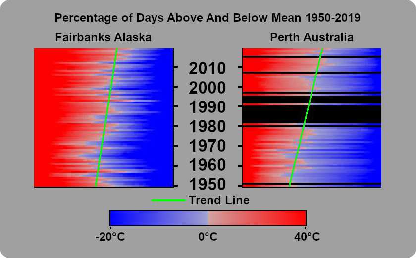
The Google Map has 236 stations each with a visualization of how the the readings of the daily temperature highs have changed over time. A preview of the map and some of the visualizations can be seen below. Each visualization shows how the percentage of days whose highest reading was over the mean highest rating has changed over time.
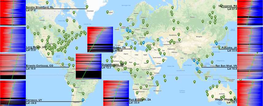
See the full map (Note: when you click on a station, Google Maps will give you information on the station that you've clicked on, and a preview of the visualization for this station. The preview is cropped, and you'll need to click on it to see the full image).
Selecting the Stations
Before we can show how stations readings have changed over time we need to decide what stations we are going
to look at, and over what period of time. Prior to 1940 worldwide station coverage was relatively poor with
760 stations globally, but by 1950 there were over around 2550 stations with broad geographic coverage. Using
that date, I first look in the dolt_log system table to find the commits corresponding to the start and end of our
time interval.
SELECT commit_hash, date
FROM dolt_log
WHERE date = '1950-01-01 00:00:00' or date = '2019-12-31 00:00:00'
ORDER by date DESC;
+----------------------------------+-------------------------------+
| commit_hash | date |
+----------------------------------+-------------------------------+
| 6euavau0131fa7g4gr62oq7radt2n0f5 | 2019-12-31 00:00:00 +0000 UTC |
| t98o66v0u8b2j0tg817dshlgl8mtb8he | 1950-01-01 00:00:00 +0000 UTC |
+----------------------------------+-------------------------------+I'll create branches corresponding to our commits for convenience, and check out the newest commit in our timeline.
dolt branch oldest_in_range t98o66v0u8b2j0tg817dshlgl8mtb8he
dolt branch newest_in_range 6euavau0131fa7g4gr62oq7radt2n0f5
dolt checkout newest_in_range
Now I want to find stations that were around at the start of our time interval, and still exist at the end of it. To get this I select all the stations in the current table that weren't added between our oldest and newest commits. The ability to query how a table has changed, is a feature of Dolt which uses the dolt diff system table. Check out the system table docs.
SELECT *
FROM stations
WHERE station NOT IN (
    SELECT to_station AS station
    FROM dolt_diff_stations
    WHERE diff_type = 'added' AND from_commit = 'oldest_in_range' AND to_commit = 'newest_in_range'
)
Pulling the Data for our Stations
As covered in the first part of this blog,
every new day of observation data is stored in a single commit. If you were to query the air_temp table you would be
able to see what the air temperatures were globally for one particular day. We want to look at data for the entire 70
year time interval, so we query the history of the air_temp table using the system table dolt_history_air_temp and
store the results into a csv. We'll be looking at the max observed temperatures for our time range in Fairbanks Alaska,
and Perth Western Australia as we create our visualization so we can go ahead and pull data for those now.
dolt sql -r csv -q "
    SELECT station, commit_date, max
    FROM dolt_history_air_temp
    WHERE station = '70261026411' AND commit_date >= '1950-01-01 00:00:00' AND commit_date <= '2019-12-31 23:59:59'
" > fairbanks_alaska-us.csv

dolt sql -r csv -q "
    SELECT station, commit_date, max
    FROM dolt_history_air_temp
    WHERE station = '94608099999' AND commit_date >= '1950-01-01 00:00:00' AND commit_date <= '2019-12-31 23:59:59'
" > perth_metro-au.csv
Visualizing the Data
We'll be using a Python program to take the data and produce images using PIL (Python Image Library). The code is available here with the main flow of the program living in csv_to_img.py.
The process of coming up with a visualization of the data that was meaningful was iterative. I began by taking the data and producing an image showing what the daily highs looked like for a given station over time. I created an image where each row was a year, and each pixel was a day. A column shows the temperatures for a single day in a calendar year across multiple years. Leap days were discarded.
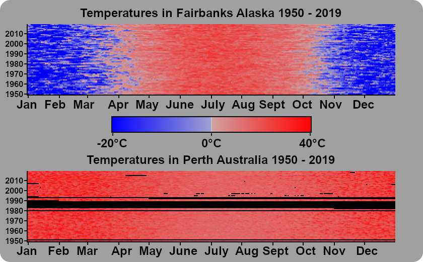
This visualization certainly conveys some information, but it has a lot of problems. Looking at Fairbanks you can clearly see the seasons. You can see some hot years and some cold years. You can also see that this particular station is very complete, in that there are almost no gaps in it's readings. Now looking at Perth, you can still see the seasons, but there is much less differentiation between the highs in the summer, and the highs in the winter. There isn't a single date where the daily high is less than 0°C. These differences are not surprising giving the differences in climate between our two sample locations. Additionally you can see gaps in the reading of this station. There are instances where the station didn't have readings for a single day, and others where multiple years were missing within this one graph.
If climate was simple and temperatures were always rising, or cooling you would see an image that looked like a funnel, where the winter months would look like they were shrinking in duration. But climate is very complex, and seeing trends in this visualization of the data is impossible.
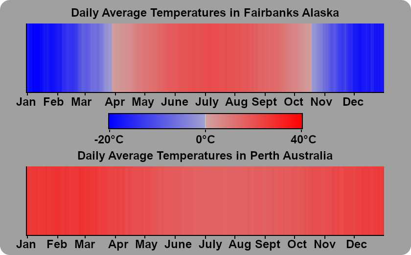
Next, I decided to take look at the average daily high temperature for each calendar day, and to see how the daily highs have changed over time relative it. To calculate the averages of the daily highs, I added up the daily high for 1950-01-01, 1951-01-01, 1952-01-01, ... 2019-01-01 and divided by our 70 year time interval. I did that for each day in the calendar year.
I took this data and generated images showing the distance from the mean high temp for a calendar year, and the observed daily high for each date in our time range.
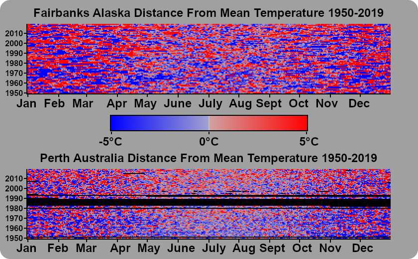
Now both of these graphs look completely random. I can't look at it and come to any conclusion about what has happened over time, and I certainly can't find a trend in that data... but what if I sorted each year? Our X-axis would no longer correspond with a calendar day, but we would be able to see the number of days where the daily high was above the mean high temperature, and that is certainly something we can draw a trend line for.
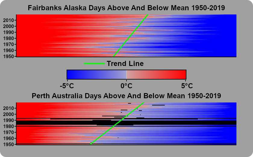
The result is something that can be easily interpreted, and shows changes over time very clearly. The biggest problem with this new graph is that it doesn't handle missing data very well. The trend line is based on the number of days over the average high temperature for a day. If 5 days were missing, even if only half of them were above the mean, skew the rate of warming will be skewed downward. Basing the trend line on the number of days below the mean has similar problems skewing the rate of cooling downward. Throwing out years where even a single data point is missing would really decrease the amount of data we are working with. As stations have gotten more reliable, this would really impact the older data in our range more than the newer data.
The final visualization renders the percentage of days above the mean, and below the mean, and discards any years where there is less than 355 valid data points. Trend lines are only drawn on images with at least 30 years with over 355 days of observations.
Putting it on the Map
Before generating these images for the over 1300+ stations that have been around during our entire time window, I threw out half of them, as the csv file generated from the query had so little data, that they wouldn't be useful. Once I had generated all the individual images, I went through and removed ones that did not have enough data to generate a trend line. I ended up with 236 stations which were added to the Google Map that I generated based on their latitude, longitude, and name from the "stations" table in dolt. Finally, I painstakingly added an image for each station on the map manually.
Final Note
While I was working on the data I played with the idea of clustering stations in order to fill in missing data. I found several places where there were 2 stations within 10 kms of each other. When clustering stations I ordered them based on which stations had the most data, and when data was missing attempted to backfill data for those dates with observations from the other station(s). 8 of the stations on the map are clusters (They are the blue ones in the clusters layer).
Try it for Yourself
Install Dolt and you clone the NOAA dataset from DoltHub completely free.